
Mikkeller collaboration: Label Workshop
Welcome along to the BrewDog label workshop. We thought we would give you a little look behind the scenes at the early stages and concepts of designing a products packaging. You know all about this beer and how it is made, we hope you would like to know a little bit about the thought process behind the packaging as well. Let's go deeper into the rabbit hole and deeper into the innermost workings of the BrewDog machine.
Firstly the collaboration beer now has a name. The 12.5% Barley Wine which BrewDog and Mikkeller joined forces to make in December 2008 will be called Devine Rebel. It has now fully fermented and tastes amazing! It is being partially oak cask aged, 25% of the beer is ageing in Speyside whisky barrels and the other 75% is ageing in one of our conditioning tanks. We wanted to get some oak flavours and tiny hints of whisky but we wanted to make this a minor part of the beers flavour profile which is why only some of it is ageing in oak. The barley wine ageing in the oak and the barley wine ageing in the tank will be re-united in April 2009 and bottled.
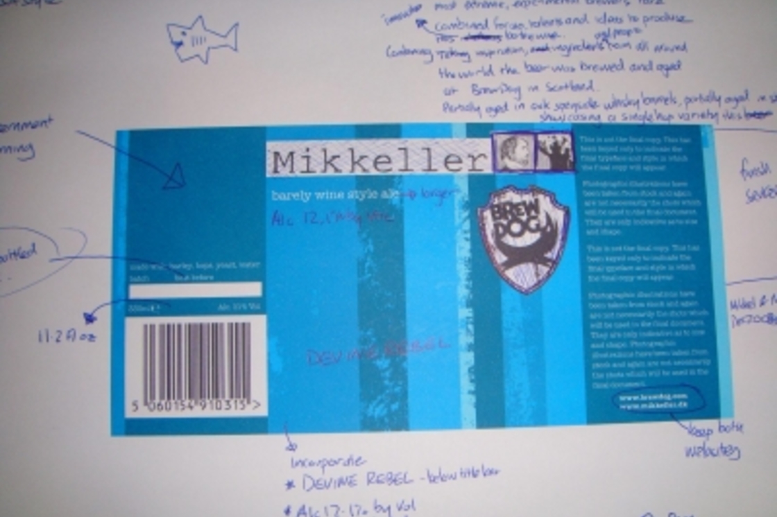
With the packaging, what we wanted to incorporate visually into the label was key elements of both brewer's strong branding. The Mikkeller and BrewDog logo are both prominent, we also added a fun tweak to the Mikkeller logo for the collaboration with the original BrewDog dog appearing alongside Mikkell. The more minimalistic feel of the label is a nod to the style of the Dane's packaging, we still have some text to add to the front of the label (name, ABV, product of Scotland) but we are going to try hard to keep the simple minimal feel. The label also incorporates the cool vertical lines typical of a Mikkeller label, yet these lines are scuffed and in various blues, typical of a BrewDog label. The version of the label I am currently working on is for the US market so there is the big blank space top left for the mandatory US government health warning.
To get the initial visual we end up cutting out and sticking loads of early concepts and drafts to bottles to get the right visual feel for the development. Our office is full of mocked up prototype product packaging and labels and designs which did not make the final cut as well as visual concepts for new products. Once we have a rough visual for the beer, then it is a case of fine tuning it and writing the text for the product. I usually draw, write and scribble on loads of draft label sheets like the one in the image above as all the various bits of text for the packaging begins to take shape.
Obviously we have had to sample the beer allot over the last few days to check how it is maturing and ensure the packaging reflects the product. Unless you visit the brewery you are going to have to wait a little bit longer until you get to sample it.
As always with our blog, we welcome and feedback or comments!
Join the Discussion
Comments (1)