Time for a change

Time for a change

We’ve come a long way since BrewDog was born in 2007, but our trusty old packaging has remained pretty much the same.
 
We love it.  We know you love it.  But it’s no longer quite reflective of where we are as a brewery. It's time for a change.
 
First and foremost, what we do at BrewDog is about creating a craft product. We don’t cut corners. We don’t add anything artificial.  We strip things back to the basics and we turn them into something awesome.
 
And we think our packaging should reflect that.


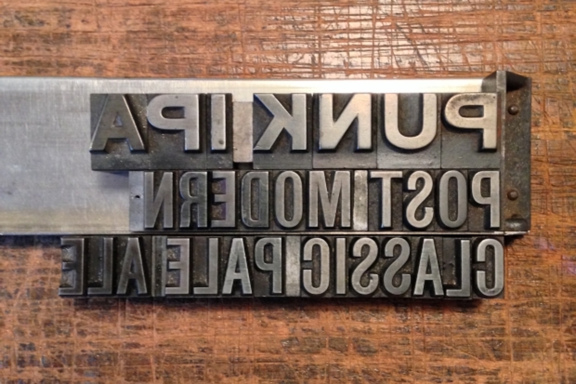
In an effort to ensure the look and feel outside our bottles matches the craft and passion inside them, we’ve started some experimental trials using real wood-cut and metal letters at one of the UK’s few remaining letterpress studios.  No computers. No photoshop.  It’s time for our packaging to become as hand-crafted as our beer.
 
Everything you see on these labels will be real.  Real texture. Real ink.  Real layers of colour. Hand-cut prints with character you can feel.
 
We’re still in the early stages but things are looking good.  Really good.
 
Take a look, stay tuned – and let us know what you think.


Share This
apollo 06.06.2014 @ 9:43am
comic sans ! just kidding... what about all the legal stuff? will that be hand printed too?
Fanboy Puppy Lover 05.06.2014 @ 8:54am
Real labels, real ale?
jonhod 04.06.2014 @ 12:44pm
dont forget your punk attitude that got you this far!
Troubledwaters 04.06.2014 @ 12:01pm
Funny how everyone is a marketing genius all of a sudden and knows whats best for Brewdog haha
Lex 03.06.2014 @ 11:03pm
Good to see youre re-thinking thd old design. Just make sure it doesnt get to hipster. I would love to see somd nice woodblock type in combination with the old brightly coloured labels.
@caiobrewdog 03.06.2014 @ 10:15pm
yes! please do it. the old fashioned way. everybody needs a change.cheers from brewdog bar sao paulo/brazil! :)
sjlunn 03.06.2014 @ 9:49pm
Please note that wooden and metal type should be viewed upside down so that it still reads left to right. I spent a five year apprenticeship learning this craft which has all but disappeared, so its great to see letterpress being used on a commercial basis again. (This message is sent from a Mac.)
J.bax 03.06.2014 @ 8:42pm
Am I the only one who noticed 5am Red Ale. Are you changing the name of 5am Saint? As a printer who has used letterpress, I think it could look great. One thing I would say is that I think you should incorporate the current colours into the new design, e.g. Punk IPA in blue or blue label paper. Look forward to seeing the final designs. Good luck!
Sae 03.06.2014 @ 8:41pm
Sounds like it will look great but as a printer I know thats going to be pricey. Will it affect the price of bottles?
RoginAlgarve 03.06.2014 @ 6:56pm
Fantastic! Love it! The outside now reflecting whats in the inside – a carefully, skillfully, lovingly made beer.
Grahamf4 03.06.2014 @ 6:52pm
I think it is a good idea. It shows that you are maturing. You established yourselves by using irreverent labels etc proclaiming the punk thing, which on reflection you must realise was really a pile of horseshit. I still liked reading it though. I like information and a chuckle. However, it got you noticed for the great beers you produce. Agree with Dog Brew in respect of beware how minimalist you go, but you are only teasing us with the type faces. I assume the shield will be staying? Ill echo Holy Macaroni! and look forward to the mock-ups.
Mac ache 03.06.2014 @ 5:26pm
crafted, authentic, quality, tactile, bold!!!!!! Whats not to like. Long live Linotype !
chuckan 03.06.2014 @ 5:20pm
I like the idea but would like to see a finished article with a bit of colour maybe. Is the brewdog logo being left off? I have to admit i do enjoy the artwork on the limited edition brews but i suppose for brand identity you have to change all the bottles to the same kind of thing(?)
GraemeB 03.06.2014 @ 3:14pm
You should do all in wingdings for one week, just for a laugh!
Dog Brew 03.06.2014 @ 3:08pm
I like the idea, especially the tactile nature of the letterpress - would be great to be able to feel the ink and press on the label. My only fear would be how this stands out on the shelf - the current labels (like or dislike) do stand out, but the low-tech letterpress style is already being done brilliantly by The Kernel, Five Points and Brew By Numbers to name a few.Sure you have more than a few tricks up your sleeve already though!
BeerXp 03.06.2014 @ 3:01pm
Drinking a Brewdog is not only whats inside the bottle: its the whole experience, from the label to the glass to the last sip to the disposal (or not) of the bottle.Producing the labels in a craft way is awesome, but the identity of the beer includes the anarchic-dirty-clean style of the labels. Lets move ahead to something new, but keeping some features of that identify.(Just like ourselves: we may get new clothes or a new haircut, but some something -- my eys, my glasses, my beard, my tattoo -- must go along with me as part of my identity).
Not HopZine Rob...honest 03.06.2014 @ 2:45pm
More labels that look like Dead Metaphor, thats the best label Brewdog have ever done!
BrewDog James 03.06.2014 @ 2:21pm
Dead Pony is staying, dont worry Ian!
Nickc 03.06.2014 @ 2:19pm
Looking great. To me, this is becoming what your labels have been trying to be. Would make me want to keep a bottle around on display
Tony barnett 03.06.2014 @ 2:05pm
Nice brewdog. .. font is a little different, altho, a change and all that. Am looking forward to the final things. Well done dudes...
BrewDog James 03.06.2014 @ 1:46pm
@C-Bomb - dont worry. We are only tweaking the packaging. The bottle contents will remain the same! As we expand we have an ever increasing focus on quality control and on making sure we always make the best beers we possible can.We live and die by what is in each and every single glass and bottle and it will always be our focus to make the best beers we possibly can.
god werb 03.06.2014 @ 1:28pm
Like the idea. Not a great fan of that font though
Ian Prise 03.06.2014 @ 1:21pm
Im not seeing Dead Pony Club anywhere here. Am I getting worried unnecessarily?
Lev 03.06.2014 @ 12:44pm
Remove the grunge stains, and use only letters, big [email protected]
C-Bomb 03.06.2014 @ 12:39pm
Theres no problem with the old packaging, but this new stuff looks really good too. Might make non-believers a bit less sceptical too. My major concern would be with over-expansion and dilution of the quality of the product, and the spirit in which it is made. I remember watching a certain clothing company from Wales fall down a similar route; some good, simple products from a limited line, then over-expansion, getting their heads stuck up their own arses, selling out, scrabbling to become small again. The last thing I want to see is Brewdog falling into the same trap-I want to be drinking this stuff when Im an old man!
tommyrecaro 03.06.2014 @ 12:36pm
I love it!
Fraser C 03.06.2014 @ 12:31pm
I love the old labels! I think they are iconic and stand out, and I think to a certain degree set the tone for the entire brewery and bar experience. However, I accept that things will move on. So, as long as there is a generic link for label to label(to show that they are family), Ill be happy. And the beer should still taste so good, hopefully!
Masterchefal 03.06.2014 @ 12:11pm
Just make sure the beer stays the same and even improves if possible.
aseftel 03.06.2014 @ 12:05pm
I mostly just care about the beer inside.As a customer, Id hope that this doesnt increase the retail price of the beer. As a shareholder, Id want to see that any margin reduction is offset by increased sales - should be feasible to test the new packaging before rolling it out.
MaliciousMike 03.06.2014 @ 12:04pm
All I care about is the beer. Not a big fan of the visual arty stuff (really see no point in instagrams existence because a face without a filter is just a face?).Cant say Im a fan of these at the moment. However as a developer, I do like and always welcome change and it will be interesting to see.
dubbel 03.06.2014 @ 12:04pm
Erm... Are you dropping the saint from 5am Saint?
Troubledwaters 03.06.2014 @ 11:52am
Great new rebrand, brilliant concept! Far better than your orginal labels
Tomas Halberstad 03.06.2014 @ 11:38am
A move in the right direction. Once you start packaging in hand made glass bottles (something for the AB-series?) youre there.
SjC 03.06.2014 @ 11:31am
Cool concept in sustaining another artisan. Hats off.
battlegarden 03.06.2014 @ 11:30am
Does this mean we can expect labels made out of paper, and a lot less pain when reusing brewdog bottles for homebrewing purposes (the plastic labels and the glue are nicely waterproof and difficult to get off)?
UremaW 03.06.2014 @ 11:29am
Looks good. Would prefer the money was spent on moving to 500ml bottles though.
Mark from Taiwan 03.06.2014 @ 11:26am
Actually , I dont care about package. What I really care is the beer inside .
HoppySteen 03.06.2014 @ 11:25am
Its great. Quality packaging raises anticipation to sample the contents.I also drink sake (so-called, rice wine - but its brewed from grain). Some brewers use hand-made paper. When I see the effort these brewers put into the labels, I know theyve created a quality product.Dont be too serious, though. Needs to playful, cheeky, in keeping with the Brewdog brand.Looking forward to seeing the results.
Hapijoel 03.06.2014 @ 11:21am
Looks great, interested to see the updated merch too...
Bottledog 03.06.2014 @ 11:21am
Glad to see this, I think the current brand (the whole punk thing) and the packaging doesnt do justice to the beer. The interiors of the bars/shops look great on the other hand, so Im looking forward to seeing the brand itself grow up a little.
Chandalf 03.06.2014 @ 11:20am
As someone who trained in typography, I love the concept. But is it maybe a Coke Classic move? (Google it if you dont know what I mean!)
Ian M 03.06.2014 @ 11:19am
Old Americana Wanted posters? Not much to see just now.
SWEET 03.06.2014 @ 11:09am
Liking the look so far, although any change is a big deal!
holy macaroni! 03.06.2014 @ 11:07am
this is pretty cool, isnt it?! Looking forward to seeing proper mockups.