BrewDog's New Packaging - An Update
BrewDog

After the mixed feedback (some amazing, some not so amazing) on Friday to our new Headliner labels, I thought I would post a detailed response running through the project overall and also letting you all help with the next steps on it. We care about your feedback so much, I even turned it into little charts.

Change is tough. And this has been a tough process for us. But if we don’t evolve, we stand still. This extends to all elements of our business. We have evolved our brewery, our beers, our marketing and our bars with a view to constantly get better at what we do. This process has been ongoing in all parts of our business over the last 12 months. One of the places where it is easiest to see this is in the great new design for our Shepherd’s Bush bar which has evolved our style and received many plaudits for doing so.

We wanted to change because we felt the old labels were no longer quite right for us as a brewery. After seven years we felt they had become a bit too young, a bit neon and a bit tacky. Although they stood out, they did not reflect the craft heart and soul of our beer. This is also not something we have taken lightly or done quickly. We had 7 agencies from 3 different countries pitch us designs and concepts and we worked with our chosen agency for over 3 months to develop the final packaging and branding.

These are some of the rejected designs:

It is still tough though, and the first time I saw any of the designs I did not like them. This is because I have been so caught up, (as so many of you have), with the current packaging over the last 7 years that just looking at any new design was a shock. However, after myself and our team spent time with them, we all felt completely committed to the evolution of the packaging and branding and we all, after a little time, loved the new designs.

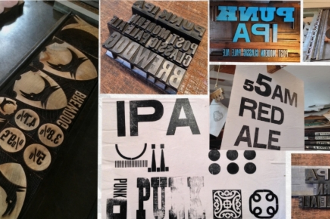
It is also very difficult to look at just the new labels in isolation and, on reflection, we should not just have posted images of the new labels by themselves. The new labels are only a very small part of an overall evolution of the BrewDog aesthetic, evolving towards a more crafted look and feel, using printing techniques and materials that reflect the artisan way in which we make our beers. The images also don’t covey the craft of the new labels the same way holding them does.

Website update:

New brew sheets:

The Beer Truck:

New DogTap signage:

We also should have got a little bit more feedback from you guys earlier in the design process. However, the bottle design process is now just 25% complete – we still have to design the Amplified range, the small batch range and also the new Abstrakt packaging is still yet to be designed.

We have decided to do this collaboratively with our customers and get your feedback on all of these developments. The new Amplified range will consist of Jack Hammer, Libertine, Hardcore IPA, Cocoa Psycho, Dogma and Tokyo*. We are looking to make the labels a bit darker and a bit more intense than the Headliner range.

We are currently considering three options. Please note that these are just flat artwork files that are subject to change, which could be influenced by your feedback. We look forward to your thoughts on the below:

Amplified Packaging Option 1:

Amplified Packaging Option 2:

Amplified Packaging Option 3:

I trust you have found it useful to get a sneak peek into the other aspects of the BrewDog design evolution project from DogTap, to our bars, the beer truck, our website and other materials and environments, and hopefully that makes the new Headliner labels and the entire project make a bit more sense. The other thing we are doing as part of this process is building a brand new and phenomenally cool Equity Punks website – stay tuned for more details on this soon. 


Thanks in advance too for the feedback on the Amplified labels, we will also run the potential new small batch and Abstrakt packaging past you guys for your comments before we proceed.


Keep on rocking in the free world,

James  

Share This
HopZine Rob 23.07.2014 @ 10:49am
It really helps to see the wider suite of applications of the design, in isolation the bottles didn’t seem to fit.I’ve just gone through a similar process at work and found ourselves in a situation where we weren’t 100% happy with what we’d been offered.I can see that the new branding is reflected nicely in comparison to the look of Brewdog in Shepherd’s Bush. The website, DogTap signage and Beer Truck are really nice.But I’m still not loving the bottle labels, All those other elements I just mentioned have a bit of white space to let the wood-block elements breath but on the labels it’s a bit frantic. Too much visual noise and the readability is very poor. In a Brewdog bar the bottles will look and feel comfortable but next to others on a shop shelf I fear that busy visual style will be off-putting and people will just move on.I completely agree with your reasons to want to move forwards but not sure this is the best direction? I spend a lot of my time searching the web for cool craft beer design on blogs and Pinterest and there is some amazing stuff out there. Go to ohbeautifulbeer.com and consider how the new Brewdog labels would perform on that website. Consider working with a great illustrator, I think James knows one ;-)I personally love the work of people like Tyler Stout and Jason Munn (Small Stakes) and Drew Millward, the guy who created the amazing artwork for Dead Metaphor. As someone who does this for a living and has recently been through a similar process it feels that you’d get a better result by involving a number of creative entities other than just an agency who does branding. I applaud you for being so up-front but I do fear that “design by comity” may lead to a watered down idea if too many people are having a say in what the labels look like.
zuuey 22.07.2014 @ 10:02pm
Havent check any updates since the AGM. I thought your approach to rebranding was great, working with an school type-setter and think the results are great. Option 1 above is my fav. Was really surprised by the amount of negative feedback though. Totally get the woking with local craftspeople to add quality. Its work great with the diversity of food available through the pubs and expending that to the labeling is great.
Zuuey 22.07.2014 @ 9:55pm
Love the new labels, especially working with old-school type-setters! Option 1 by a country mile for me. Background colour contrast & definition on 2 & 3 look too muddy and not clear whats going on.
Scott T 22.07.2014 @ 9:18pm
Option 3 I think. Best to keep a strong colour code element to the label - dont wont to get home and find out you picked Libertine off the shelf instead of Hardcore (or vice versa)!
joeblackwell 22.07.2014 @ 7:21pm
Option 3 gets my vote, but I think all of the new packaging and re-branding looks great. Its pushing the brand forward, giving it a more artisan edge and elevating things to a slightly more mature level. Lets not forget, packaging is important, but its what is inside the bottle that counts.
Lily782 22.07.2014 @ 1:52pm
I have to say, I love the new bottles. I was a bit sceptical when that blog came out announcing there would be a re-brand, but they actually look quite beautiful, which seems appropriate for the nature of the beer. Also, the mock up of the new website looks amazing. A lot more slick and professional, and less like it was made by a 15 year old on their bedroom computer. All good things from me!
John C 22.07.2014 @ 12:44pm
Option 3
Grahamf4 22.07.2014 @ 11:07am
Hard to decide between option 1 and option 2 for the Amplified range. I was not too sure about the new design, not in relation to the old design as such but more that it looked a little too supermarket. Think Tesco range of craft style. However, I now think they are the bees knees. I can understand the need for the labels to grow up and approve. Where I think they fall down is on the copy. Looking at the Punk label, the copy has been changed somewhat but it still shouts out juvenile. I know that change has to be gradual and the new copy comes across as trying to sound more grown up i.e evolved but it comes across as slightly incoherent e.g. We have a terminal craziness to make the beers that we want to drink. What does terminal craziness mean. That sentence detracts what it it is you are trying to say about Brewdog. You may as well say we are wacky!The description of the ale itself still smacks of that we are punk schtick and contradicts the evolution of the beer and brand to a degree. This would be the harder part to change but the apocalyptic mother should go as it is no longer relevant. As should the Ramones reference. In the second paragraph the steel yourself for Kalashnikov bursts... incendiary... Just dont seem to fit anymore. The third paragraph just seems to be irreverant. Quintessential Empire Not something I would be proud of associating myself with. Smacks of casual racism/imperialism. Embrace the punked up, pimped up Maharajah.... This just reads daft However, I could imagine it on a t-shirt. Brewdog is not about trend, it is about style. Its about being a cool brand that you want to be associated with. I think you could do that without reverting to type. I remember first seeing your branding in 2008 and I really liked it at the time.I picked up a wee booklet in Edinburgh to bring home. Then I tried your beers and was blown away. There was a time for that copy but that time is over. This now feels incredibly forced, which in turn will make it feel false and will give a sense of the corporative, when you have always railed against that.
dergit 22.07.2014 @ 8:06am
dont get me wrong - I like their look. I just think they lack the clarity the old designs or some of the early pitched ones had. Judging from the pictures it seems you have to get quite close to make out the name and style of the beer whereas with the old labels, I could spot any brewdog bottle from across the shop.
robc 22.07.2014 @ 7:54am
My initial thought after seeing the new design was that when you put it on a shelf alongside other brands, theres nothing about it which is unique or would make it stand out. On the contrary, they are confused and its quite hard to instantly recognize which beer accompanies each bottle. What makes the old packaging distinct are its colors and the fact that, like 5am Saint, I know by the color which BrewDog it is. If anything, the second set of labels of the initial concepts is the most promising, but not perfect.I think the reason why Im most surprised is because there wasnt any public consultation or input prior to the rebranding. I almost assumed that EquityPunks at least would have the chance to give input before a decision would be made. As a shareholder, Im quite surprised that such poor judgment has been made here - especially if youve already consulted with a number of agencies. As a customer, the overall aesthetic is still ugly. I still look at it and wonder why the text is upright?Im all for a refresh if its necessary…but its replacement needs to be equally as pretty.
tops 22.07.2014 @ 5:07am
Glad youve resisted the temptation to plaster them with a message saying, Same great beer, great new look! (joke)Most concerned by the lack of mention for Riptide!
sherwicf 22.07.2014 @ 1:51am
Why change the name of Dead Pony Club to Dead Pony Pale Ale though? To let people know what style the beer theyre buying is? Similar issue to Holgate Brewing in Australia whos Mt Macedone Ale is one of the beat pale ales in the country but it probably doesnt sell as much because it doesnt have the word Pale on the packaging
willjsporter 22.07.2014 @ 12:34am
Best design for me so far is to left rejected. More to the point though, I think it would be an awful shame to change the abstrakt branding, its some of the best Ive seen in the beer market
sjlunn 21.07.2014 @ 11:21pm
Must be option 3 – its an Amplified version of the Headliner range.
kevinT 21.07.2014 @ 9:21pm
Its clearly a cost cutting measure to reduce the amount of colour used on the new labels in comparison to the old. Im probably stating the obvious here but dont ever seem to see this being mentioned by any of yous?For 7 years the people (all of us) have been drinking these beers. We all know folk who dont drink brewdog and mention its aimed at the younger blah blah blah so changing the label does 2 things. It gives those people who claim the beer is aimed at younger folk a chance to get on board as the new label may appear more sophisticated as it suits more their style (these are the folk who will absolutley love the new labels straight from the off) plus it opens a new style on the shelves in supermarkets trying to draw in more attention.Those are the only reasons for changing such well recognised labels on a bottle. FACT! The last fact is, regardless of the label, I sure as hell wont be changing my beer and neither will any of you as its too damn good! Id happily buy them without any label. Its time to embrace it folks and let them do what they need to do....
Brewdoug 21.07.2014 @ 8:50pm
Option 2.3 is good also, 1s colour schemes are not bold enough and looks cluttered as a result.
JLMM 21.07.2014 @ 8:38pm
Option 2 because of the improved readibility.
Grant0610 21.07.2014 @ 8:30pm
I am not sure why you are changing current designs. Still look fresh. In my opinion the new designs are a mess! I am currently in Iceland on holiday and I really like the Einstok labelling. Simple, modern, classy and identifiable. I personally think the new design cheapens Brewdog image a bit. As long as the beer stays the same not too bothered though! ;)
George M 21.07.2014 @ 6:41pm
Option 2 for me as the white text is more focused, 1 and 3 are like ironing a shirt with small checks!
Graeme A 21.07.2014 @ 6:29pm
If you must change, Option 3 for the Amplified range, however please leave the Abstrakt as they are - they are already different from the main brand and do not need to stand out on a shelf.
Jamesdm 21.07.2014 @ 5:43pm
I didnt like the new designs at first but now they have grown on me, Im quite excited to see them on the shelves.
Lex 21.07.2014 @ 5:28pm
Please dont go for option 2. This makes no sense when going for that whole letterpressed look. White letters on a darker background: this makes it look like it has been put tofether in photoshop (which it probably has).I would love to see some brightly colored backgrounds, with some deep black printed letters.And I agreee with the above: why are the texts sideways?
mmmsome 21.07.2014 @ 5:05pm
I originally wrote some fairly negative feedback on Facebook, but seeing the Punk label in context above (ESPECIALLY the brew sheets) does make a big difference. I actually think the design will grow on me a lot. Originally I think my main issue was with the bold font IPA background - at a glance, it looks quite muddled just a general background colour scheme, but maybe it takes actually holding the bottle to make it clear. On zooming into the images above I can see there IS actually a subtle weathered effect which is what I thought wad missing.I have no issue with the vertical text. You dont have to turn your head to read it, unless you are seriously cognitively under-developed. Amplified option #1. Love the washed out, clean effect, although I do also like the Jack Hammer colours in #2.Ill miss the words Club and Saint from the respective beers though... I really think those particular words gave them the character they have.It is fucking awesome that James took the time to analyse the feedback and post this. Thanks and good luck.
Ollie 21.07.2014 @ 4:28pm
V glad the rejected designs were rejected - they look quite atypical of a brand trying too hard to be quirky whilst attempting to hide the massive commercial machine behind the bottle.Im actually a fan of the new designs - the lack of space between the badge and Brewdog where they appear together irks me a tad though. I do agree that the existing designs look young. Love the process involved in producing the designs and that youre sharing this in such detail.
SL 21.07.2014 @ 4:06pm
What fonts are you going for with the new layouts? Are you selecting from existing typefaces or looking at having your own created?
Mr T 21.07.2014 @ 3:56pm
Love the new labels and design.You are never going to keep everyone happy with the packaging.Just ensure you keep on making people happy with the beer.
Beerking22 21.07.2014 @ 3:32pm
To be honest these labels just look like they will wash away into the background of any off licence ! There is nothing different or unique about them. These actually look very similar to the Tesco revisionist beers! Why would you want your product to look like tesco own brand ! Sack the marketing team and start again I say.
Scarlot 21.07.2014 @ 3:30pm
the most dark & intense one (to me) is option 3 !
Jenrq 21.07.2014 @ 3:08pm
Option 2!
RossBrew 21.07.2014 @ 2:57pm
Has to be option 2. Great work!
GerryZ 21.07.2014 @ 2:56pm
I must be getting old, I really passionately hate all of the new designs. I dont like having the bold text scrolling on the label, as a background, with then a different colour of text on top. Just doesnt work for me. Secondly, i have to ask why the text is written side on? If Im browsing a supermarket shelf, Im not looking that way. Furthermore, it just doesnt pop,mans wont stand out from the crowd. Other than the face pictures, I actually prefer the rejected ones, The labels are in a readable font, and are the correct way up. They would get noticed on a crowded shelfHave you thought about presenting them to a customer panel of some sorts. The folks here are all passionate about your beer, so its effectively preaching to the choir. Try some market research, put them in front of random people not affiliated to the beer, and see what kind of general reaction people give to them.Rather a long winded reply, but I care :-)
kate w 21.07.2014 @ 2:39pm
Still dont get why the beer labels have the text going up the bottle?
Throcken 21.07.2014 @ 2:33pm
Nr 3 with white instead of black! Nr 2 has the wrong color for HC.
sebtull 21.07.2014 @ 2:26pm
The new packaging looks amazing, screw the haters!I would also say option 1 or 3, both look amazing
lrasinen 21.07.2014 @ 2:22pm
Option 1. I think it stands out the best in the shelf, surrounded by othee colorful labels
KevDog 21.07.2014 @ 2:16pm
Option 2 definitely...
Gar 21.07.2014 @ 1:51pm
Option 2 looks the best to me, 3 is fine too. The new design of the punk bottle is already growing on me. I think with such a radical change it is always going to be a bit jarring at first sight.
penx 21.07.2014 @ 1:35pm
I didnt like the design when I saw Punk on its own, as posted on Facebook, but when I clicked the link and saw the set together, it made more sense. If you only posted the link on Twitter, maybe that partly accounts for the difference in reaction to places where people just saw Punk on its own.Still not convinced you need to change branding, but Im sure people will warm to it.
Milton Glaser 21.07.2014 @ 1:30pm
None of above“I have a theory that most of design, in general, is the creation of affection. When it comes to craft beer labeling..... it comes down to creating a label that looks quirkily amateurish — if not downright unprofessional. This creates a paradox: How do you deliberately create the illusion of not knowing what you’re doing when you actually do?”
SimonG 21.07.2014 @ 1:19pm
Definitely number 2. Im a big fan of the new packaging, I always found the old style kinda childish.
John Smith 21.07.2014 @ 1:18pm
Why didnt you go for the labels with the beards on???????????? (No need to answer, its pretty obvious). All the rejected designs are terrible.
morris 21.07.2014 @ 1:16pm
I totally ägde with adamnich above. Option 2 is best of the three presented label designs. However, I would much rather see the top left of the rejected designs. Cheers! Keep on brewing awesome beer.
DEG 21.07.2014 @ 1:11pm
Option 2 - interesting, yet clean and readable.
Mike6 21.07.2014 @ 1:07pm
Number 2!Great to have some input on the designs thanks
AK 21.07.2014 @ 12:59pm
Option 2!
FIA 21.07.2014 @ 12:57pm
Option two for the amplified series looks good, the black writing on such a dark background is hard to read, whereas the white writing looms a lot clearer.Whereas I do kinda like the new designs, I do wonder how much the decision was influenced by the reasons above, and how much of it was a response to the Portman groups recent whinging.I hope theres a big middle finger up to them on the new Dead Pony label!
BeerDude 21.07.2014 @ 12:56pm
Dont mind the new designs, more so when I see the rejected ones! Option 2 for the amplified range.... Can the Beer Truck be hired ? We want a Beer Truck blog!
andyhawkes 21.07.2014 @ 12:48pm
Option 2 - the others suffer from bad contrast with the black text on a darker background.Like the new aesthetic though - its an interesting and positive refresh.
NickF 21.07.2014 @ 12:46pm
Option 2. Think you need to keep the colours that people know for the beer.
aparker 21.07.2014 @ 12:44pm
I like option 2 on the amped range and also like the top left of the rejected options.It would be a shame to re-brand Abstrakt as theyre basically part of a series.
pyge 21.07.2014 @ 12:36pm
If this is the final options we get then #2 definitely. Still way too much stuff going on in the labels though.
Baldy Steve 21.07.2014 @ 12:26pm
For the small batch range I would love to see you continue to use similar artwork to that seen on black jacques and everyday anarchy.
Thomsly 21.07.2014 @ 12:19pm
Option 2 looks good.
rpi 21.07.2014 @ 12:18pm
three !
NTo 21.07.2014 @ 12:18pm
Option 2 for me
beersiveknown 21.07.2014 @ 12:15pm
option 2 for amplified. Why not get johanna to do the ABSTRAKT labels?
adamnich 21.07.2014 @ 12:14pm
Option 2 by a mile. The colour contrast between the white text and the body/background works better than the black and is less busy. Still a bit busy but hey-ho. Personally i like the top-left rejected design. Its much clearer. Not a fan of text on its side. A combo of the two would be worth a look.
MB 21.07.2014 @ 12:13pm
Option 2
Scott C 21.07.2014 @ 12:13pm
I love the new look - feels like a perfect evolution of the brand. Cant wait to see the new bottles for myself and how this change continues... As for the negativity, youll always get people resistant to change. But as you said, if you dont keep changing, youre standing still. Keep it up!
charlesg 21.07.2014 @ 12:11pm
I think the new labels look pretty cool. Its the right thing to do.
Stephen T 21.07.2014 @ 12:09pm
Option 2. The eye is naturally drawn to white rather than black, and so stands out more.
Cinulph 21.07.2014 @ 12:03pm
I like the dark print on the bottles - over the lighter labels - however, its probably worth fading the colour behind the black text - as the small text at the top is almost impossible to read in examples 1 and 3. The white text comes on a non-dark background implies negativity,
Mick-BS 21.07.2014 @ 11:58am
Prefer option 3
Ne0X41 21.07.2014 @ 11:57am
Option 2 for sure
Lana Svitankova 21.07.2014 @ 11:54am
I like option 2 the most
Olefattguy 21.07.2014 @ 11:53am
Option2, no doubt in my mind. Thanks for the new design input, now the shock has worn off a bit, i am ready to re-assess my previous (negative) harsh opinion. Oh, and THANKS for not going with the bearded faces on the labels, phew...! ;)
mikeeeeeeey 21.07.2014 @ 11:52am
Fuck all the subjective Facebook feedback.
LM 21.07.2014 @ 11:51am
Option 2I like the new packaging but on first glance the labels seemed too busy - might be slightly off-putting for people not familiar with the brewdog range.
Arnold J. Martijn K 21.07.2014 @ 11:50am
Option 3! And will the beer truck do a tour on the continent? Might convince locals to help find locations for new bars… ;) #BrewDogBrussels
AleBeHonest 21.07.2014 @ 11:49am
I agree with the evolution of the brand and change can be hard to take. Seeing the fuller picture helps the acceptance that times are changing. Put my vote for option 2 for the amplified into a pretty little pie chart.
minute44 21.07.2014 @ 11:49am
Forget the new packaging, how the hell do I get near that bloody beer truck!?**I personally loved the new designs. Option 2 gets my vote. :)
Josh 21.07.2014 @ 11:48am
I think the design agency you are you using havent cracked it. Looking at the rejected designs, they just havent given you the right stuff yet. The new labels are just so confused, especially the amplified versions. The best thing Ive seen in all these work in progress pictures is the photo of the painted up Punk in bright blue. Keep on with the letterpress but just pair back, and keep the bold colours.. its your signature.
Thomas C 21.07.2014 @ 11:35am
Option 2
BS 21.07.2014 @ 11:33am
I totally love ampl. one. The white and still dirty labels are really appealing.
jfp 21.07.2014 @ 11:25am
option 2!
jo 21.07.2014 @ 11:24am
Actually liked the new labels anyway, but this looks even better. Option 2 for the amplified range please!
daryl 21.07.2014 @ 11:22am
Please rebrew all the previous Abstrakts in their new packaging!
JackP 21.07.2014 @ 11:21am
Thanks for explaining further! Love the beer truck - when will we see it? Can I request a home visit?!