
BrewDog's New Packaging - An Update
After the mixed feedback (some amazing, some not so amazing) on Friday to our new Headliner labels, I thought I would post a detailed response running through the project overall and also letting you all help with the next steps on it. We care about your feedback so much, I even turned it into little charts.

Change is tough. And this has been a tough process for us. But if we don’t evolve, we stand still. This extends to all elements of our business. We have evolved our brewery, our beers, our marketing and our bars with a view to constantly get better at what we do. This process has been ongoing in all parts of our business over the last 12 months. One of the places where it is easiest to see this is in the great new design for our Shepherd’s Bush bar which has evolved our style and received many plaudits for doing so.

We wanted to change because we felt the old labels were no longer quite right for us as a brewery. After seven years we felt they had become a bit too young, a bit neon and a bit tacky. Although they stood out, they did not reflect the craft heart and soul of our beer. This is also not something we have taken lightly or done quickly. We had 7 agencies from 3 different countries pitch us designs and concepts and we worked with our chosen agency for over 3 months to develop the final packaging and branding.
These are some of the rejected designs:

It is still tough though, and the first time I saw any of the designs I did not like them. This is because I have been so caught up, (as so many of you have), with the current packaging over the last 7 years that just looking at any new design was a shock. However, after myself and our team spent time with them, we all felt completely committed to the evolution of the packaging and branding and we all, after a little time, loved the new designs.


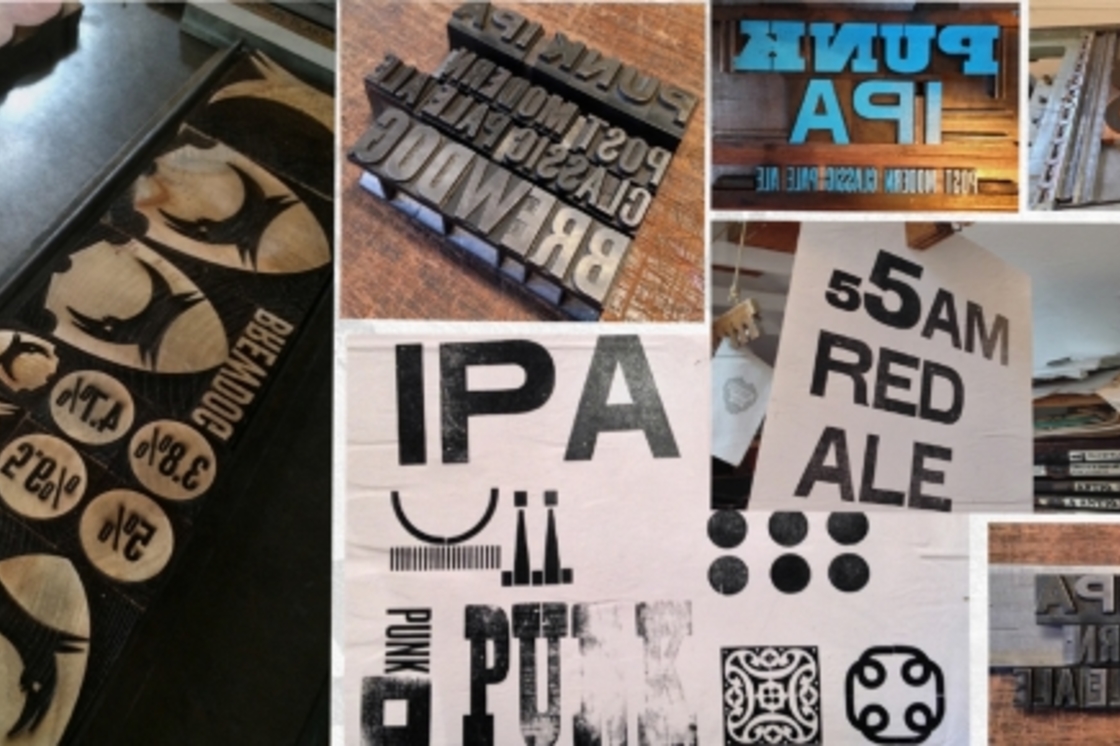
It is also very difficult to look at just the new labels in isolation and, on reflection, we should not just have posted images of the new labels by themselves. The new labels are only a very small part of an overall evolution of the BrewDog aesthetic, evolving towards a more crafted look and feel, using printing techniques and materials that reflect the artisan way in which we make our beers. The images also don’t covey the craft of the new labels the same way holding them does.
Website update:


New brew sheets:

The Beer Truck:

New DogTap signage:

We also should have got a little bit more feedback from you guys earlier in the design process. However, the bottle design process is now just 25% complete – we still have to design the Amplified range, the small batch range and also the new Abstrakt packaging is still yet to be designed.
We have decided to do this collaboratively with our customers and get your feedback on all of these developments. The new Amplified range will consist of Jack Hammer, Libertine, Hardcore IPA, Cocoa Psycho, Dogma and Tokyo*. We are looking to make the labels a bit darker and a bit more intense than the Headliner range.
We are currently considering three options. Please note that these are just flat artwork files that are subject to change, which could be influenced by your feedback. We look forward to your thoughts on the below:
Amplified Packaging Option 1:

Amplified Packaging Option 2:

Amplified Packaging Option 3:

I trust you have found it useful to get a sneak peek into the other aspects of the BrewDog design evolution project from DogTap, to our bars, the beer truck, our website and other materials and environments, and hopefully that makes the new Headliner labels and the entire project make a bit more sense. The other thing we are doing as part of this process is building a brand new and phenomenally cool Equity Punks website – stay tuned for more details on this soon.
Thanks in advance too for the feedback on the Amplified labels, we will also run the potential new small batch and Abstrakt packaging past you guys for your comments before we proceed.
Keep on rocking in the free world,
James
Join the Discussion
Comments (78)